Since the track opened in 1909, the now-famous wheel & wing logo has graced the official program, tickets, and other paraphernalia for the Indianapolis 500. Arguably a unique race logo has also been featured on the face of the TICKETS almost every year dating back to 1911. In some cases these were simple variations of the wheel & wing logo, but in some years, some marvelous designs have been featured, indicating the date and oftentimes the ordinal.

Prior to 1981, however, the logo featured on the ticket was usually not seen anywhere else, even on the cover of the race program. It was in 1981 that the Speedway began marketing the race in official capacity with a dedicated unique annual logo. This logo was printed on the ticket, the program cover, the official poster, on signage around the facility, on official USAC inspection decals, on television and print media, on credentials, pace car graphics, merchandise, apparel, patches, hats, and numerous other paraphernalia.

Ordinarily the annual race logo would be released to the public a little over a year before the race happened. It would be seen on the top of the ticket order form page in the previous year’s official program. We’re going to focus on the Indianapolis 500 logos since 1981. We’ll start by taking a look at each of the logos from the 1980s.
| History of Indianapolis 500 Logos | |||||
| 1980s | 1990s | 2000s | 2010s | 2020s | Brickyard 400 |
1981
|
|
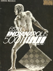
The first logo of the series started a trend of exclusive red and blue (on a background of white) colors. This color scheme mirrors (whether intentionally or coincidentally) a similar red/white/blue trend many of the annual Super Bowl logos used in the late 1970s-1980s. The ordinal (“65th”) became a permanent fixture of the logo, and the traditional full name “Indianapolis 500” was used. The shorthand nickname (“Indy 500”) was decidedly avoided, and all previous references of “International Sweepstakes” were permanently removed. One thing missing from some versions of the logo was the date – May 24. On the program, the date was located below the bars on the left. Also, on the program, the logo appeared in all white. Perhaps most noticeably, the logo was prominently displayed on the flag stand at the start/finish line – a tradition that continued for decades. A large version of the logo was placed on the doors of the pace car, but not in full color. It was in a solid orangish-red.
1982
|
|
|


The logo in 1982 continued the trend of red & blue on white, and this time the date was prominently visible. On the official race program, the logo was depicted in color for the first time. Also different was the ordinal spelled out (“sixty-sixth”). The ABC-TV telecast utilized a computer-generated version of this logo for its commercial bumpers. The logo again appeared on the doors of the pace car, in original red-blue colors, although the panels of the doors made for a silver rather than white background.
1983
|
|

For 1983, red & blue on white was used again, though blue was much more prevalent. The all-caps, bold, arial-type font was used once again for the word “Indianapolis” and the date, and the number “500”, but a cursive font was used to depict the ordinal (“67th”). On the program and the official poster, the logo appeared in a solid gold color, and did not appear on the side of the pace car (Buick Riviera). The logo (in solid brown) was placed, however, on safety trucks during the months. ABC-TV did not use the 1983 logo on their broadcast, recycling a version of the 1982 logo instead.
1984
|
|
|


In 1984, the logo design featured a new font, and for the first time, included the a version of the famous Indianapolis Motor Speedway wheel & wing logo. Once again, the logo was not featured on the side of the pace car (Pontiac Fiero), nor did it appear on the side of the safety trucks. On the official program and official poster, the logo was depicted in a shiny brass color, matching the bas-relief sculpture that was used for the official race artwork. On television, ABC-TV used the original version, with a reflection effect added.
1985
|
|
|

The red/white/blue look is used again, but the fonts become more creative for 1985. The wheel & wing logo is situated inside the middle zero of the “500” for the first time, and the wings have a hint of a chrome-colored reflection effect. On the race program, the logo was shaded. The version of the logo that appeared on ABC-TV was true to the original.
1986
|
|
|


The logo for 1986 had a shield look to it, the first one to be contained within a shape. The race was rained out on the original Sunday race day (May 25), and was also rained out on Monday (May 26). The race was rescheduled for the following Saturday (May 31), but no revision was ever made to the logo to correct the date. As the 1986 race celebrated the 75th Anniversary of the first “500” in 1911, a second anniversary logo was made, and appeared on the cover of the program. During the month, however, not much attention focused on the milestone, and only a very small amount of merchandise featured the alternate logo. On the program and the official poster, a stylized version of the logo was printed, with a shading applied to the colors to simulate a sleek, reflected finish. In addition, the wings were shaded tan/brown resembling feathers. ABC-TV created a computer animated version of the 1986 logo, and used it in their broadcast during intros and commercial bumpers. It was actually reused by ABC through 1989, although with the date and ordinal removed.
|
|
|
|


For the first time in four years, the annual logo appeared on the side of the pace car. The 1986 pace car (Chevrolet Corvette) had a full color logo decal on each of the front fenders, along with a small medallion affixed on the middle console near the gear shift.
1987
|
|
|


For 1987, the ordinal was spelled out (“THE SEVENTY FIRST”) for the first time since 1982, and the wheel & wing icon had a lesser size compared to previous. For the first time, the word “Indianapolis” was in mixed-case rather than all caps. Once again the logo was carried on the fender of the pace car, and on some merchandise, was presented as part of an bigger illustration. A careful look at the version of the logo printed on the program, poster, and tickets, shows the colors (red and blue) were reversed. The version printed in the 1986 race program had the word “Indianapolis” on top in red and the “500” on bottom in blue. But by May 1987, the colors had swapped. New for 1987 were the dot-matrix message boards at the Speedway. A fairly accurate depiction of the 1987 logo saw rotation on the boards during the month of May. In addition, a second sign bearing the race logo was affixed to the starter’s stand. One was attached on the officials’ booth above the flagman, and another smaller version was affixed to the starter’s perch itself.
1988
|
|
|


The ordinal (“72nd”) was back to being number, and would be proceeded by the indefinite article “THE” for the final time. The version of the logo unveiled in the 1987 race program, and the version appearing on the cover of the 1988 official program was the familiar red & blue on white color scheme, with the word “Indianapolis” in blue and the “500” in red. However, the colors were for some reason reversed in the version of the logo printed on the 1988 race tickets. The version of the 1988 logo that appears on the pace car (Oldsmobile Cutlass Supreme) was mono-color silver, and moved to the rear fenders.
One thing missing for 1988 was the race logo on the flagstand. After the 1987 race, the scoring booth on the top of the flagstand was removed. A sign bearing the race logo was not affixed the to starter’s stand for the next several years.
1989
|
|

The 1989 logo went in a new direction, mostly maintaining the typical red & blue on white, but stylizing the “500” numbers in a brush stroke effect. A very thin font (mixed-case) was used, along with decorative mini checkers flanking the date. When the logo was first unveiled in the 1988 race program, the wheel & wing icon was solid dark blue. However, at some point before the month of May 1989 the wheel & wing icon was changed to a blue wheel with yellow wings outlined in blue. The mini checkers were missing, and the date font was increased in size, making it more legible. On the Pontiac Firebird pace car, the 1989 logo appeared on the top of the windshield in solid white, flanking on either side, the word “PONTIAC” which was in the middle.
| History of Indianapolis 500 Logos | |||||
| 1980s | 1990s | 2000s | 2010s | 2020s | Brickyard 400 |
Sources/References
- 1981 Indianapolis 500 Official Program – Indianapolis Motor Speedway
- 1982 Indianapolis 500 Official Program – Indianapolis Motor Speedway
- 1983 Indianapolis 500 Official Program – Indianapolis Motor Speedway
- 1984 Indianapolis 500 Official Program – Indianapolis Motor Speedway
- 1985 Indianapolis 500 Official Program – Indianapolis Motor Speedway
- 1986 Indianapolis 500 Official Program – Indianapolis Motor Speedway
- 1987 Indianapolis 500 Official Program – Indianapolis Motor Speedway
- 1988 Indianapolis 500 Official Program – Indianapolis Motor Speedway
- 1989 Indianapolis 500 Official Program – Indianapolis Motor Speedway
- 1982 Indianapolis 500 Telecast – May 30, 1982 (ABC-TV)
- 1983 Indianapolis 500 Telecast – May 29, 1983 (ABC-TV)
- 1984 Indianapolis 500 Telecast – May 27, 1984 (ABC-TV)
- 1985 Indianapolis 500 Telecast – May 26, 1985 (ABC-TV)
- 1986 Indianapolis 500 Telecast – May 31, 1986 (ABC-TV)
- “Legends of the Brickyard” – 1987 Indianapolis 500, ESPN
- “Indy 500 Pace Cars” (1997) – Publications International, ISBN 0785320636
- Photographs from the JI500 Collection
You must be logged in to post a comment.